Work


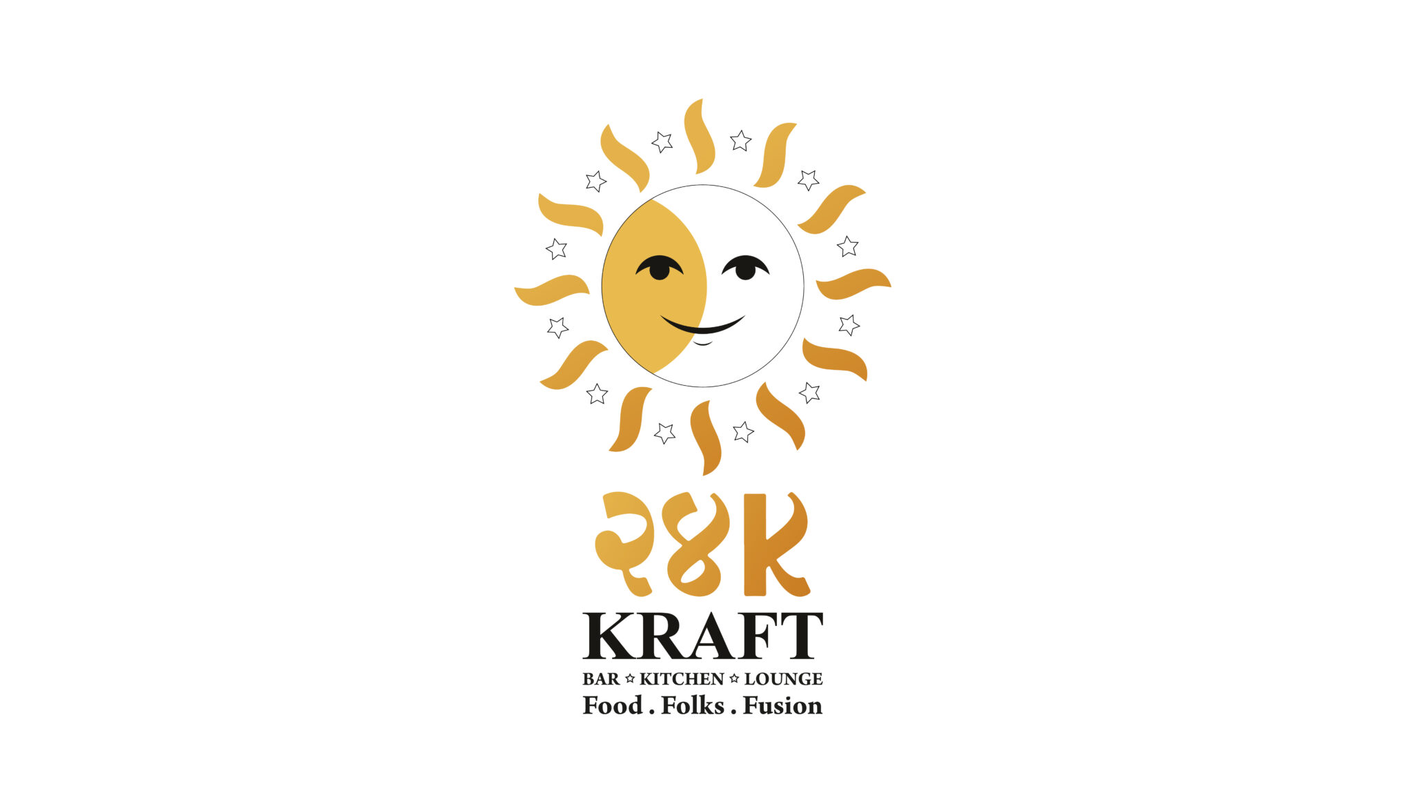
Brand Identity – 24K Kraft Brewz
Admin / Jun 19, 202524k Kraft is based in the Viman Nagar, Pune market area. A place where you can be thrilled with the variety of beers, exquisite food, and chic decor. It is a perfect fusion of lounge culture and delicious food.
Living in this digital world, for such a happening place like 24k Kraft, it becomes necessary for them to enter this world with bang-on space design. Well known for its Delicious food and unique beers. As soon as you walk in, you’re greeted by a relaxing outdoor bar, and wide fine dining as soon as you step inside. A dining space where people can spend quality time with their family, as well as a lounge with some of the best music in the house to chill with friends.
Challenge:
When it comes to challenges, many people are aware that lounges and bars earn little during the week but make a boom on weekends. It’s not simply that a new startup or newly opened place is essential for a pioneer brand to establish itself in the market and maintain its brand value.
Our client was sailing on the same boat. For the same purpose, 24k Kraft approached us to build its essence across the industry.
HIS Approach:
Because 24k Kraft did not have a tagline, We proposed a tagline for the brand to help customers understand what the brand will provide.
While creating a brand, a tagline plays an important role in building the brand. Many people remember the brand just because of the tagline. A tagline plays an essential part in the development of a brand. The tagline alone is enough to make many people remember the brand. We thought the tagline should be straight so that people can easily understand what the brand is about.
Tagline: Food.Folks.Fusion
When it comes to space designing this is how we found a great solution to the client’s problem. The space was elegant, and the brand offered some fantastic beers with an Indian twist and tasty food. As the brand offered a variety of beer flavours ranging from local to worldwide, We produced a series of illustrations to promote and portray the specialty of the beer that is crafted by 24k.
We created a series of illustrations that were focused on the business, and we paid close attention to every detail. We considered making abstract food illustrations that may effectively convey information about a variety of flavorful brews.
The challenge was also to attract the corporate audience. Since Viman Nagar is the commercial hub, it is filled with many corporate offices and hence it has a major chunk of the corporate audience. Therefore these illustrations were then paired with content about how the beers are being brewed. This will amaze people about the process and ingredients used by the 24k to create the tastiest and most flavorful beers in town. This design was eventually used as frames on the walls surrounding the tables, allowing the audience to read easily and keep audience engaged until their delicious food is on the table.
We also made creative illustrations in the lounge to brighten the ambiance and allow people to relax and enjoy their tipsy times. The illustrations were developed in bright colours because the target audience was youthful, and we thought that keeping them vivid and vibrant would connect them.
Since it is located in a market area in Pune, the exterior facade design had to be stunning. The cool illustration embraced the facade of 24k to draw the viewers. The outside area features a relaxing ambiance in which you can relax with your friends. Because the target audience that would most likely sit outside was likely to be young, these illustrations were designed in a wacky style.